
Unimove is a mobile web platform for university students to search for apartment rentals and subleases near their schools. This is a conceptual project for educational purposes only.
92% direct success rate when completing tasks
82% overall user satisfaction
During my time as a student at UCLA, Facebook university groups were one of the most used platforms for students to find apartments.
When I was looking for an apartment on Facebook groups, I often found myself having to look through multiple groups and hundreds of posts, only to find that none of them matched my needs or requirements. I wondered if other students shared my struggles and if there was a way to remedy the problem.
So I asked the question — how can I help university students better find apartments that fit their needs?
For the scope of this project, I audited only Facebook groups as the main platform, although other options exist, such as Reddit and Instagram.

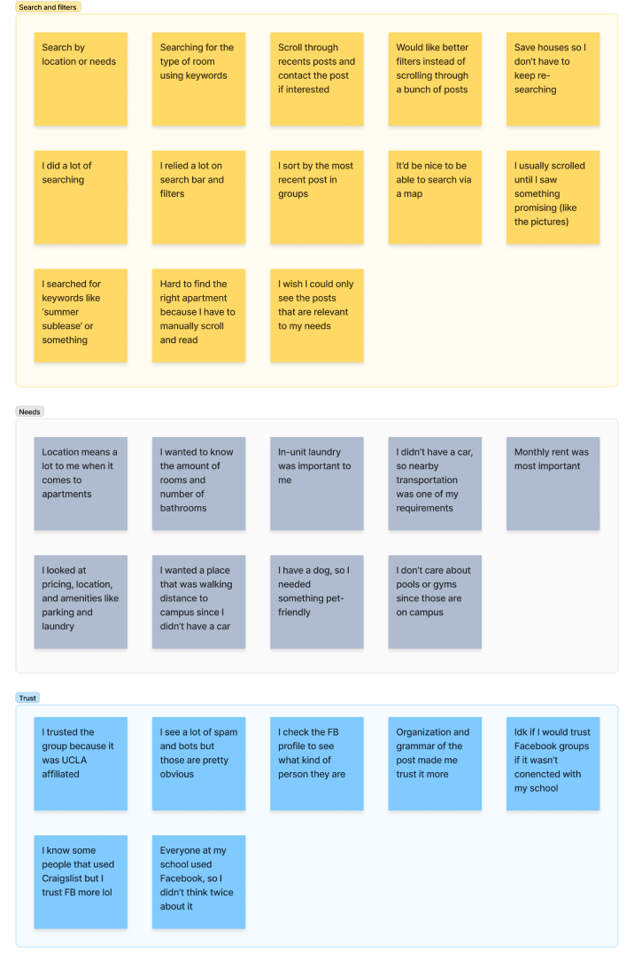
To validate my hypothesis and understand the problem space, I recruited 10 university students and conducted 30-minute interviews over Zoom.
After synthesizing the results in an affinity map, I was able to narrow down the problem areas I will be focusing on.
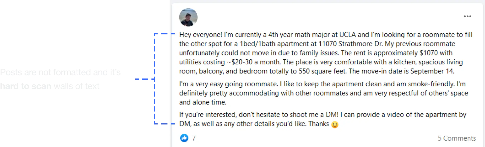
Facebook groups search function is not designed to be able to filter through posts for apartment specifications. It is limited to text only.
Sometimes people posted a brief post that didn’t contain a lot of information. Users expressed that they wish to know more before messaging.
More often than not, the original poster doesn’t update their post if they’re not looking anymore, making it hard to tell if the offer is still available.

I used the information I learned from my research participants to craft a user persona to help me focus the problem to solve user pain points.

Below are the highlights of the solution to help university students have a better experience finding apartments:

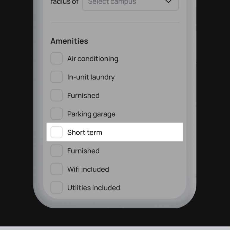
Since the product is targeting university students, I decided to focus on adding filters that is specific to a university student’s needs, that other competitors don’t have (ex: campus walking distance).

The current solution has users joining multiple groups, all of which serve the same purpose. By having a dedicated platform, users can be sure that they are seeing all there is to offer in one place.

Posts are often hard to read and scan due to lack of formatting and too much information. I want to design a solution that presents the most important information first to allow users to scan and narrow down their choices quickly.
After some initial sketches, I created lo-fi wireframes and an interactive prototype in order to conduct usability testingon my design solutions to make sure the flow I created was intuitive to users.

I conducted 3 moderated and 26 unmoderated usability tests via Zoom and Maze. Overall, 92% of the users experienced little to no confusion completing the tasks I set out for them. However, I did gain valuable feedback on how to improve the experience.
I used a frequency-to-severity matrix to help me prioritize user feedback. Feedback that was high in frequency and severity were focused on first.

To ensure a consistent visual experience across all screens, I defined some guidelines and built out a design system. I made sure to follow common design patterns and accessibility guidelines for mobile web experiences. Below is a small snippet of the whole system:


💡
Tip: Hover your cursor over the phone to play the animation.
I learned how to present my work to designers who were not involved in my design process at all and didn’t possess the same familiarity with the project as I did. It’s important to give others to right context for them to give constructive feedback.
When I first started ideating, I had a grand vision and a number of ideas I wanted to execute, including designing an roommate matching system to go with the product. Soon, I realized that my focus was too broad and that roommates is a whole separate monster on its own. I knew it wasn’t possible to explore that side given the time that I had and had to cut down the scope and focus.
